(English) How to Choose Your App’s Layout?
The Main Screen tab is the main screen of your app. It’s where you can navigate through all app pages.
Under the «Main Screen» tab, you can choose how this screen will look like, by selecting a layout

We created app layouts that focus on key features, creating an experience that encourages your clients to take action on your app. From buying a product to schedule an appointment, this section is all about layouts that encourage actions on your app. By the end of this video, you will know how to choose the perfect app layout for your business.
To edit your Main Screen screen:
- Go to the Edit App section, from the left main menu of the workspace
- Go to the «Main Screen» section.
- And the «Page Layout» tab.
- Here you can try out layouts, and choose the one that fits your needs.
Note: Every layout looks a bit different on each operating system.
There are 12 types of layouts:
- Carousel
- Grid
- One button
- Bubbles – Need either Coupons or Booking features (or both)
- Booking- need Booking feature
- Mobile Shop- need the Mobile Shop feature
- Loyalty Focused
- Single Promotion
- Loyalty Light
- Multi Promotion
- Vertical Selection- you will need the feature you wish to promote with this slider
- Horizontal Selection – you will need the feature you wish to promote with this slider
1. The Carousel layout
The carousel layout is an interactive way to let your users navigate between all the screens and possibilities available in your app.
The icons are the thumbnails that once you click on one of them, they lead you to the page.
NOTE: These icons appear only on the Grid and Carousel layouts of your Main Screen.
For each page of your app, you can edit its icon. Learn how to add an image
Your new icon appears here and this is how it looks like on your mobile app.
You can always undo and return the original icon of your theme by clicking on the back icon. Don’t forget to click Save once you finish!

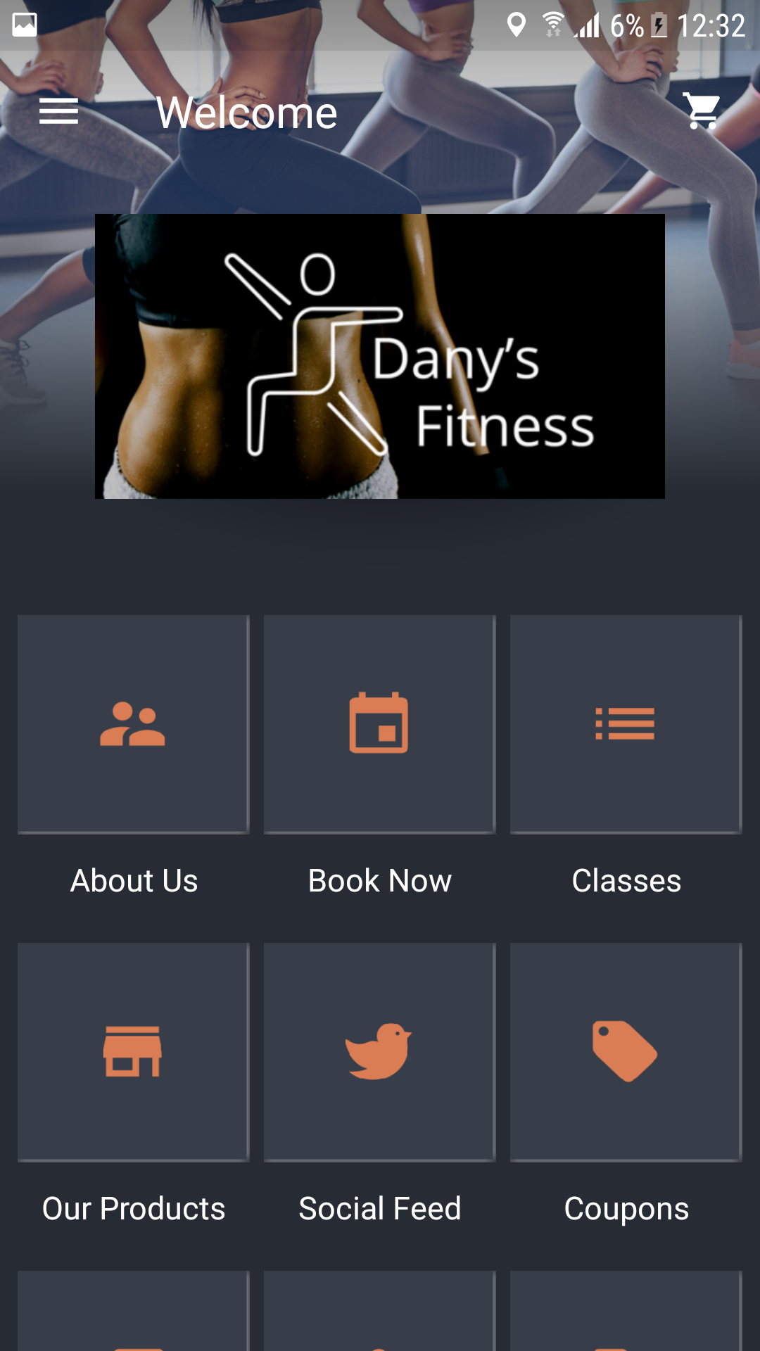
2. The Grid layout
The Grid layout shows icons of all the screens available on your app. The users will tap each icon and it will lead him to the requested screen.
The icons are the thumbnails that once you click on one of them, they lead you to the page.
NOTE: This icon appears only on the Grid and the Carousel layouts of your main screen.
For each page of your app, you can edit its icon. To do that, go to the «About us» page, and hover over the image, click the edit icon.
You can add an image from bobile library or upload your own. Learn how.
Your new icon appears here and this is how it looks like on your mobile app.
You can always undo and return the original icon of your theme by clicking on the back icon. Don’t forget to click Save once you finish!
3. The One Button layout
The ‘One Button’ layout has a main call-to-action button, encouraging your app users to book an appointment or promote a coupon.
Click on “This button” and choose what you want to promote from the drop-down menu:
To book an appointment, choose “Schedule a meeting”
- Fill in the required fields
- Select an employee and service type
- And click ‘save’
Or choose «promote a coupon»
- Fill in the required fields
- click ‘Change’ to select an existing coupon.
- And click ‘save’

4. The Bubbles layout
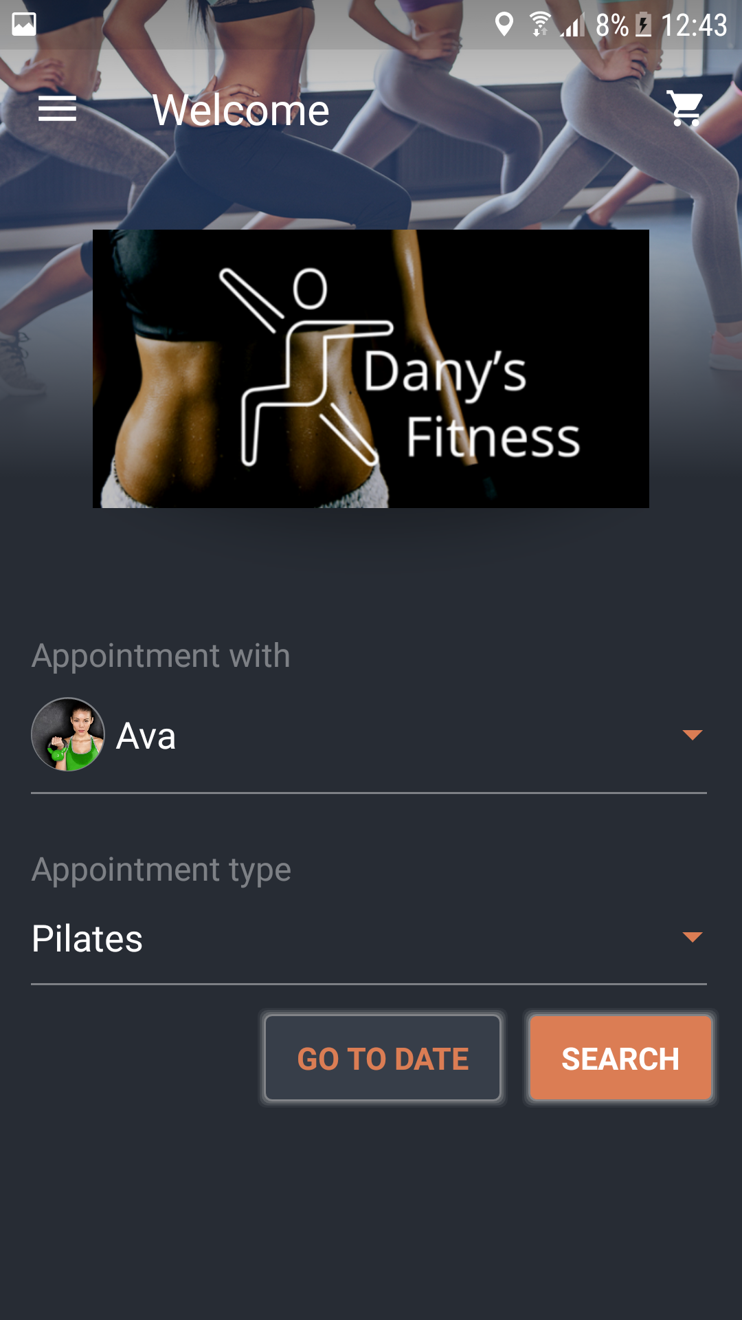
5. The Booking layout
This layout is for service-based businesses. If you use the app mainly for booking, we recommend choosing this layout. With this layout, clients will book appointments or classes directly from the main screen of your app.
You need to have the Mobile Bookings features to be enabled in order to use this layout.
Simply select an employee and a service, and click Save.
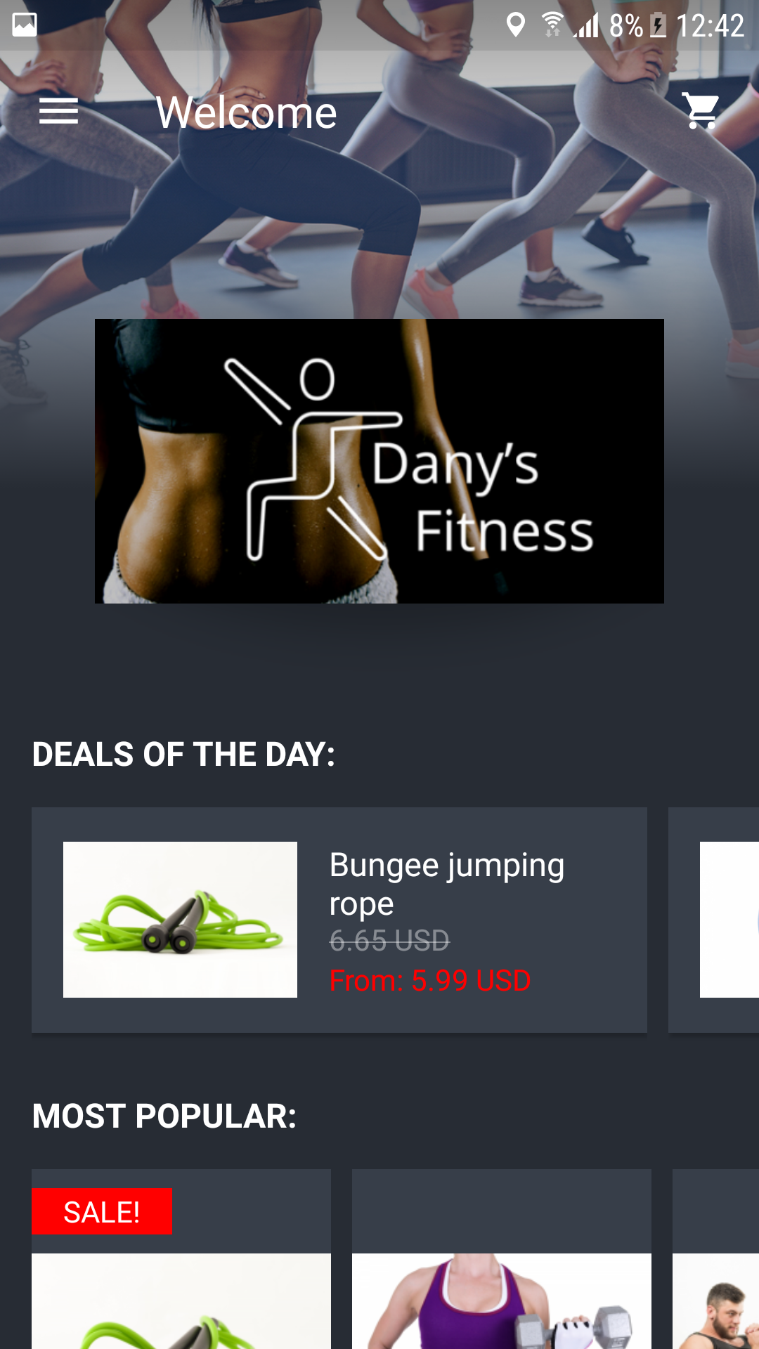
6. The Mobile Shop layout
If the main purpose of the app is selling, this layout is the best one to use. The ‘Mobile Shop’ layout allows the pp owner to promote his shop on the main screen of the app to encourage clients to start shopping as soon as they open the app.
You must set up the Mobile Shop feature in order to use this layout.
7. Loyalty Focused
This point shop focused layout enables showing all the loyalty program features on the opening screen of the app – the membership tier, point shop, rewards, Loyalty cards, and notifications. In the top section, you can select what to present – bookings, products, sale items and more based on the focus of your app.

8. Single Promotion
This layout will serve you well if you wish to feature and promote different elements of your app by using content and images on your welcome screen. The Call-to-Action button will lead to wherever in the app you define.

9. Loyalty Light
This loyalty program focused layout enables showing some of the loyalty program features in the opening screen of the app – the membership tier and point balance with 2 call-to-action buttons to the point shop and rewards. In the top section, you can select what to present – bookings, products, sale items and more based on the focus of your app.

10. Multi Promotion
This loyalty program focused layout enables showing some of the loyalty program features in the opening screen of the app – the membership tier and point balance with 2 call-to-action buttons to the point shop and rewards. In the top section, you can select what to present – bookings, products, sale items and more based on the focus of your app.

11.Vertical Selection
This layout is an interactive way to let your users navigate between products and services you provide. The Call-to-Action button function is based on what you present. For example, if you feature your products, it will lead to the products list.

12. Horizontal Selection
This layout is an interactive way to let your users navigate between products and services you provide. The Call-to-Action button function is based on what you present. For example, if you feature your products, it will lead to the products list.

12. Subscriptions Layout
This layout enables clients to view and easily use their subscriptions and punch passes.
* The Subscription feature can be used only when connecting the account to Stripe (in countries where the service is available) – in this case, you will only be able to attach Punch Passes in this layout.
